Event Branding: Enhancing User Experience and Event Engagement

Overview
I led the experience design for Spectrum, the Annual College Fest of NIFT Hyderabad, overseeing the visual design and collaborating with multiple teams to create a cohesive event experience for over 5,000 attendees. This involved supervising the development of all visual materials across all touch points, aligning the design with various teams and event's goals to craft an engaging experience for all attendees.
I led the experience design for Spectrum, the Annual College Fest of NIFT Hyderabad, overseeing the visual design and collaborating with multiple teams to create a cohesive event experience for over 5,000 attendees. This involved supervising the development of all visual materials across all touch points, aligning the design with various teams and event's goals to craft an engaging experience for all attendees.
Role:
Visual and Experience Design Lead
Duration:
Jan- Feb 2024
Platform:
Stage Display, Print Materials, Social Media
Collaborators:
Coordinators across teams like sponsorship, decor, logistics, social media

Challenge
Create a cohesive visual identity that resonates with the audience while ensuring seamless navigation and engagement for both attendees and organizers. The design decisions must facilitate smooth collaboration between various teams, such as décor, social media, sponsorship, and logistics.
Create a cohesive visual identity that resonates with the audience while ensuring seamless navigation and engagement for both attendees and organizers. The design decisions must facilitate smooth collaboration between various teams, such as décor, social media, sponsorship, and logistics.
Goals
Enhance attendee satisfaction by designing a user-centered event experience that is visually appealing, easy to navigate, and memorable.
Provide clear design guidelines to simplify coordination between organizing teams, ensuring consistency and efficient execution across all event elements.
Enhance attendee satisfaction by designing a user-centered event experience that is visually appealing, easy to navigate, and memorable.
Provide clear design guidelines to simplify coordination between organizing teams, ensuring consistency and efficient execution across all event elements.
Research
Before selecting the theme for the event, we conducted thorough research and gathered critical information, including:
Key touchpoints attendees would experience throughout the event
Visual aesthetics that would resonate with the audience
Seamless integration of the theme across all teams, especially for the fashion show
Entertainment value and engagement potential of the theme
Footfall over two days
Social media strategy and potential reach
Potential sponsors and their alignment with the theme
Previous year budgets and financial considerations
Coordination of various competitions
Security measures for attendee safety
This prioritization ensured a user-centric, cohesive, and well-executed event theme.
After carefully considering the potential implications of the theme on graphics, decor, sponsorship, and the fashion show, I proposed an idea that received unanimous agreement as the selected theme.
After carefully considering the potential implications of the theme on graphics, decor, sponsorship, and the fashion show, I proposed an idea that received unanimous agreement as the selected theme.
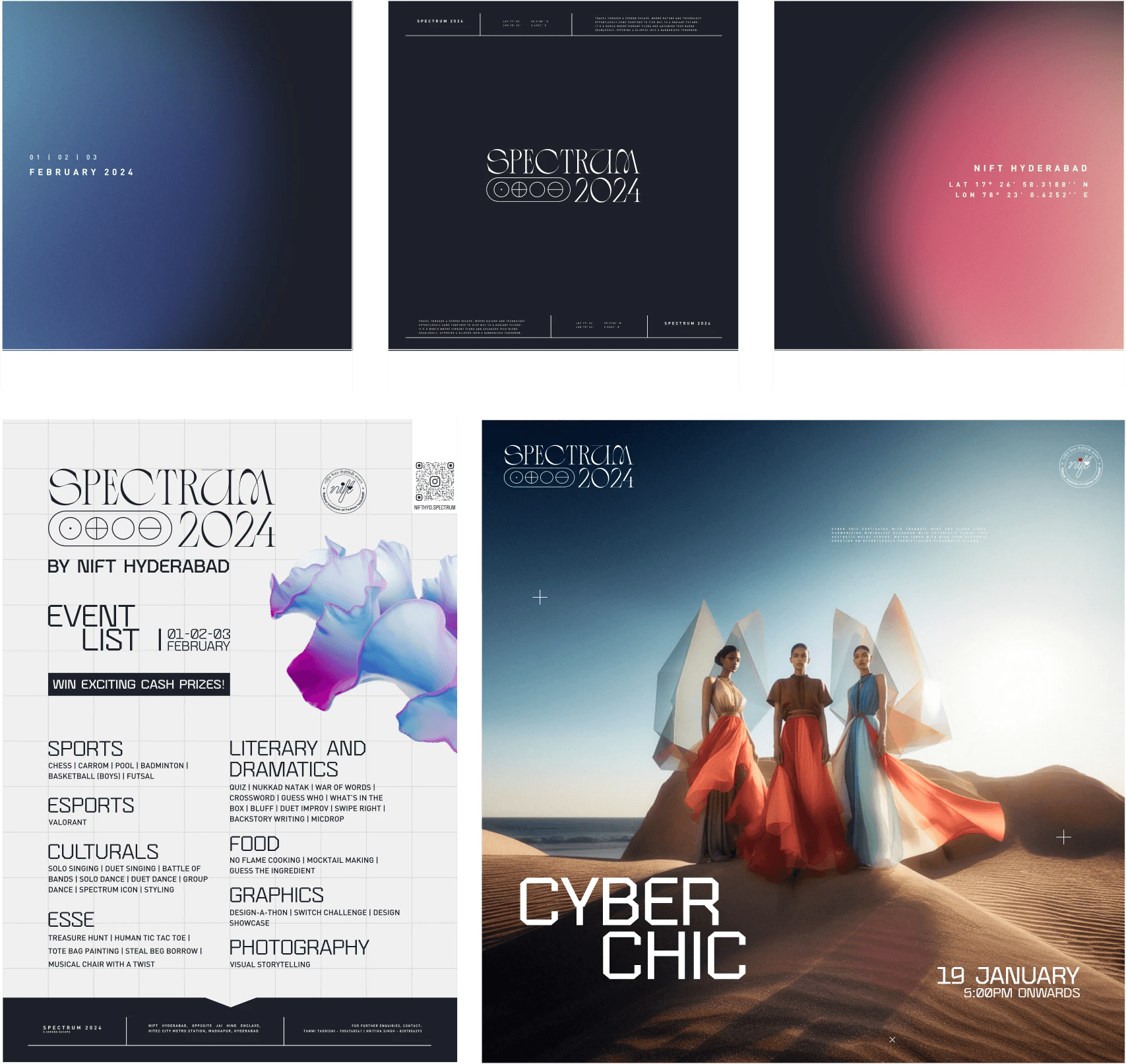
"A Serene Escape"
is our Glimpse Into the future where technology and nature blend seamlessly to bring out the better versions of ourselves
Process

DISCOVER
We identified the theme, coordinated with other teams to understand the required collaterals, made a graphic team, looked for inspiration and collected information
We identified the theme, coordinated with other teams to understand the required collaterals, made a graphic team, looked for inspiration and collected information
DEFINE
As a team we defined the color palette, typography, logo, mascot and design elements and created a system.
As a team we defined the color palette, typography, logo, mascot and design elements and created a system.
DEVELOP
We developed the necessary collaterals like t shirt design, banners, posters, social media, stage animations, by following the defined identity.
We developed the necessary collaterals like t shirt design, banners, posters, social media, stage animations, by following the defined identity.
DELIVER
We coordinated with other teams and vendors to execute our ideas across all touchpoints and found means to rectify errors.
We coordinated with other teams and vendors to execute our ideas across all touchpoints and found means to rectify errors.

Journey Mapping

1 of 5
Color Palette
The color palette is simple and clean, featuring off-white and deep grey as primary colors. These are complemented by gradients in various shades, with blues and pinks selected as secondary colors. This palette aligns with our theme, reflecting a futuristic aesthetic while cooler tones provide a serene, calming feel.
The color palette is simple and clean, featuring off-white and deep grey as primary colors. These are complemented by gradients in various shades, with blues and pinks selected as secondary colors. This palette aligns with our theme, reflecting a futuristic aesthetic while cooler tones provide a serene, calming feel.


2 of 5
The Logo
Our interpretation of 'serene' for the logo is the perfect balance of edges and curves, symbolizing harmony. The goal was to inspire viewers to reflect on how two contrasting styles—sharp and soft—can seamlessly come together in a thoughtful, cohesive design
Our interpretation of 'serene' for the logo is the perfect balance of edges and curves, symbolizing harmony. The goal was to inspire viewers to reflect on how two contrasting styles—sharp and soft—can seamlessly come together in a thoughtful, cohesive design
3 of 5
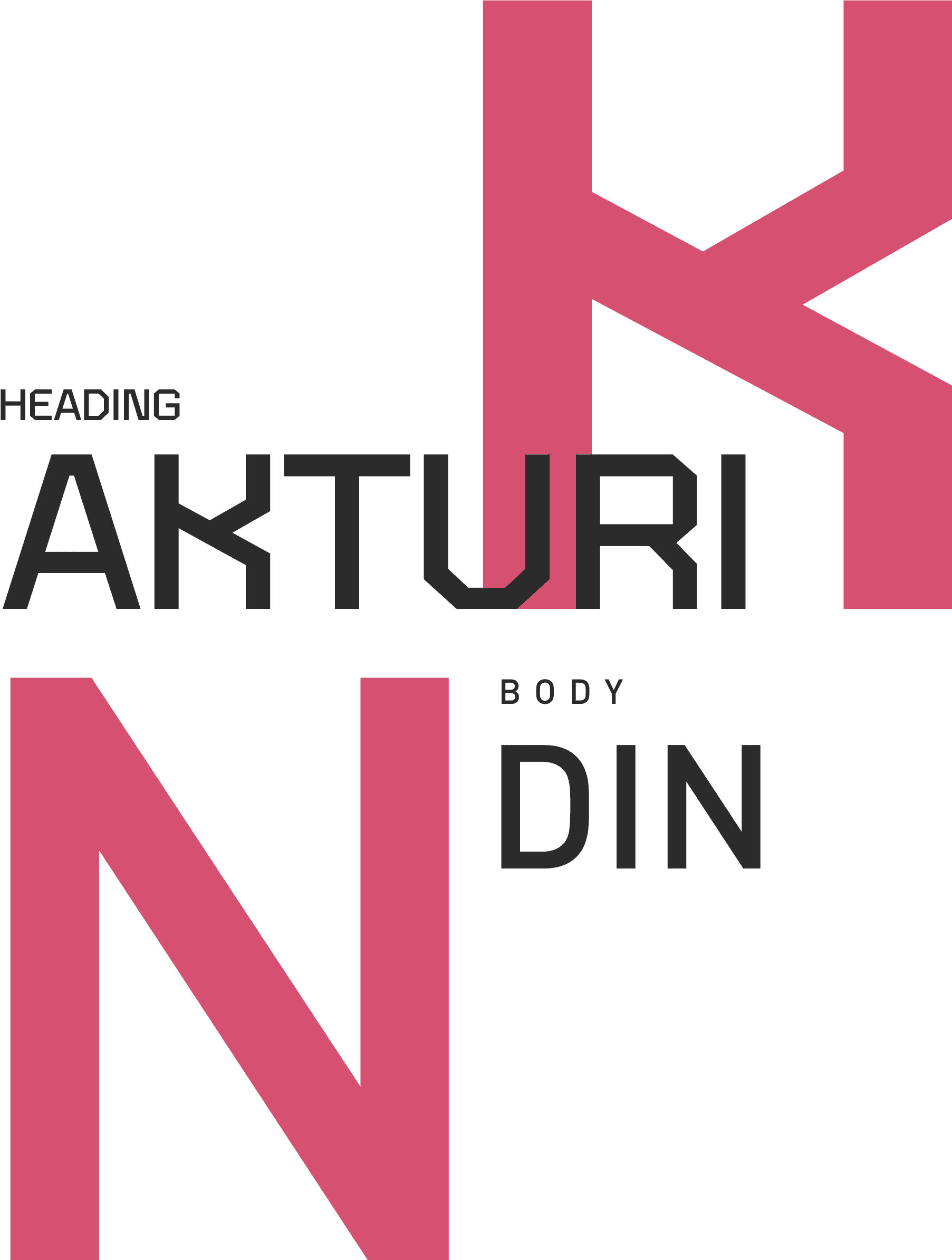
Typography
Akturi by prototype labs is a modular, techy and futuristic faux monospace display typeface that acted as our primary font.
Din was chosen for body text due to its versatility, readability and pure simplicity.
Akturi by prototype labs is a modular, techy and futuristic faux monospace display typeface that acted as our primary font.
Din was chosen for body text due to its versatility, readability and pure simplicity.

4 of 5
The Elements
We took inspiration from the 4 elements of nature as a tribute to our roots. We used the standardized symbols of the elements that suited our aesthetic
We took inspiration from the 4 elements of nature as a tribute to our roots. We used the standardized symbols of the elements that suited our aesthetic
5 of 5
The Spectrum Flower
Instead of a usual mascot with a face, this year we wanted to try out something fresh. The initial idea was to design our own flower with its own attributes and scientific name
Instead of a usual mascot with a face, this year we wanted to try out something fresh. The initial idea was to design our own flower with its own attributes and scientific name
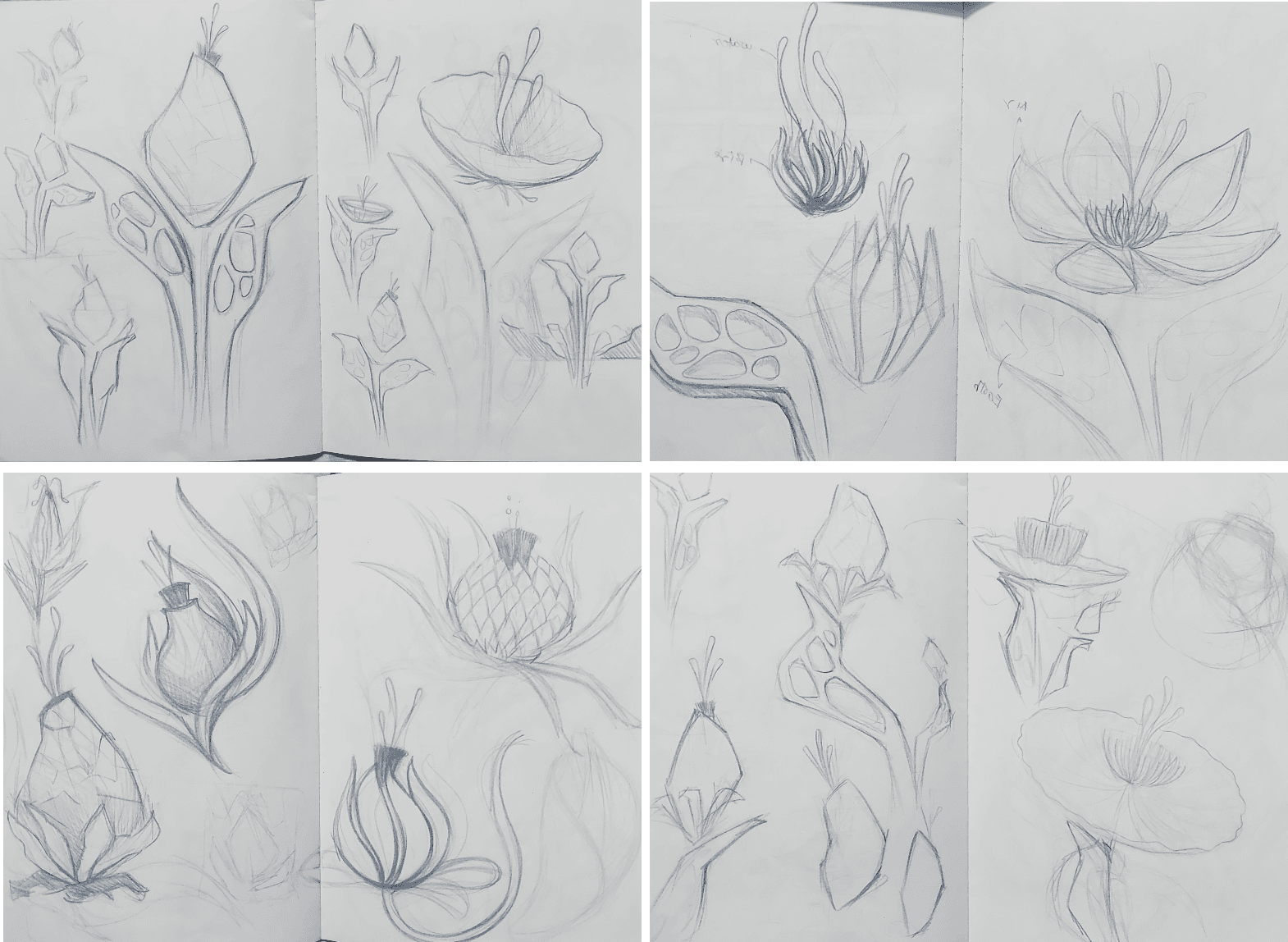
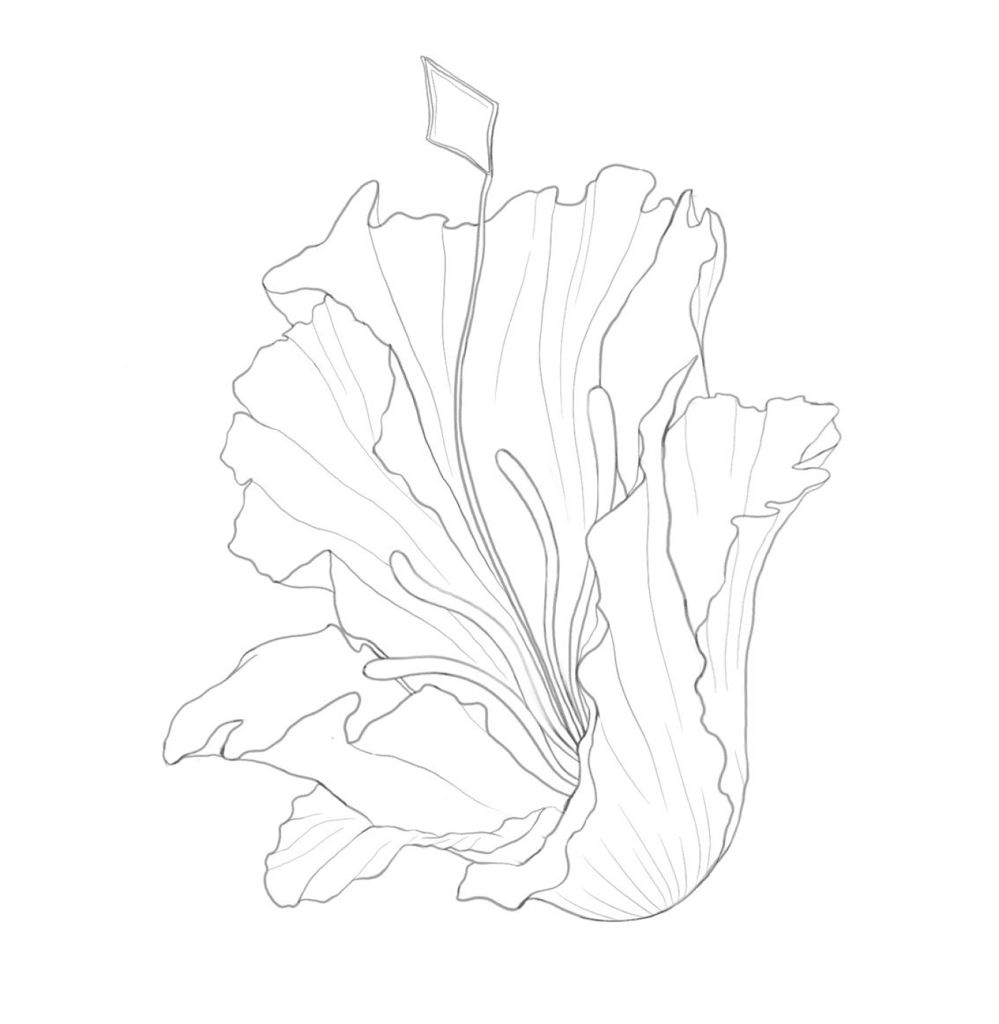
Soon we figured out a way to portray the theme through the organic shape of the flower and rendering it in a gradient, crystal like material. We also had to take into consideration that the creatives team can make a physical output of the flower.
The spectrum flower represents serenity, tranquility and harmony
Execution
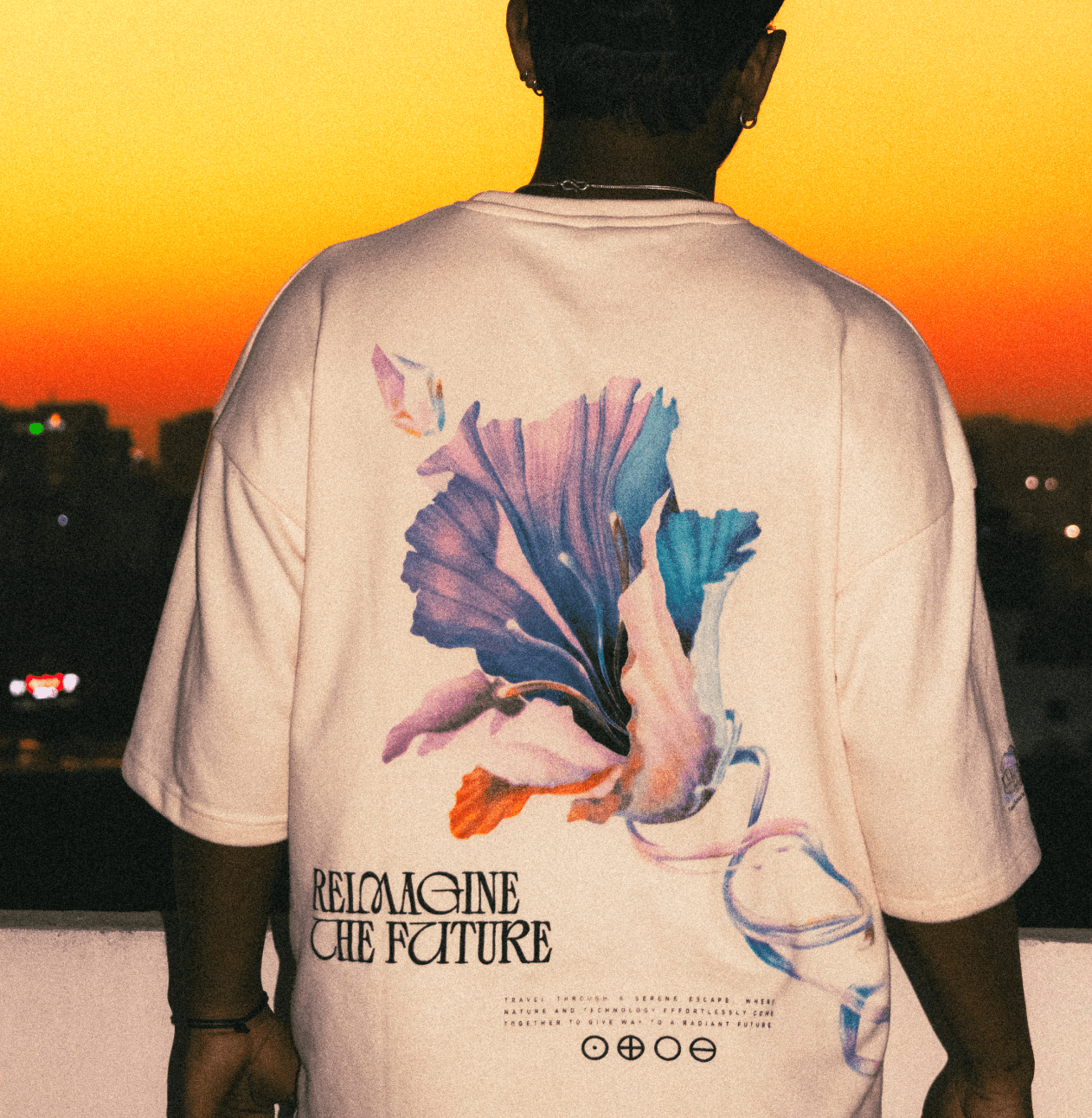
Tshirt Design
the spectrum flower makes up most of the t-shirt design. the t shirts were exclusive merch made of 240 gsm cotton with the mascot digitally printed, symbols and main text as puff print.
the spectrum flower makes up most of the t-shirt design. the t shirts were exclusive merch made of 240 gsm cotton with the mascot digitally printed, symbols and main text as puff print.


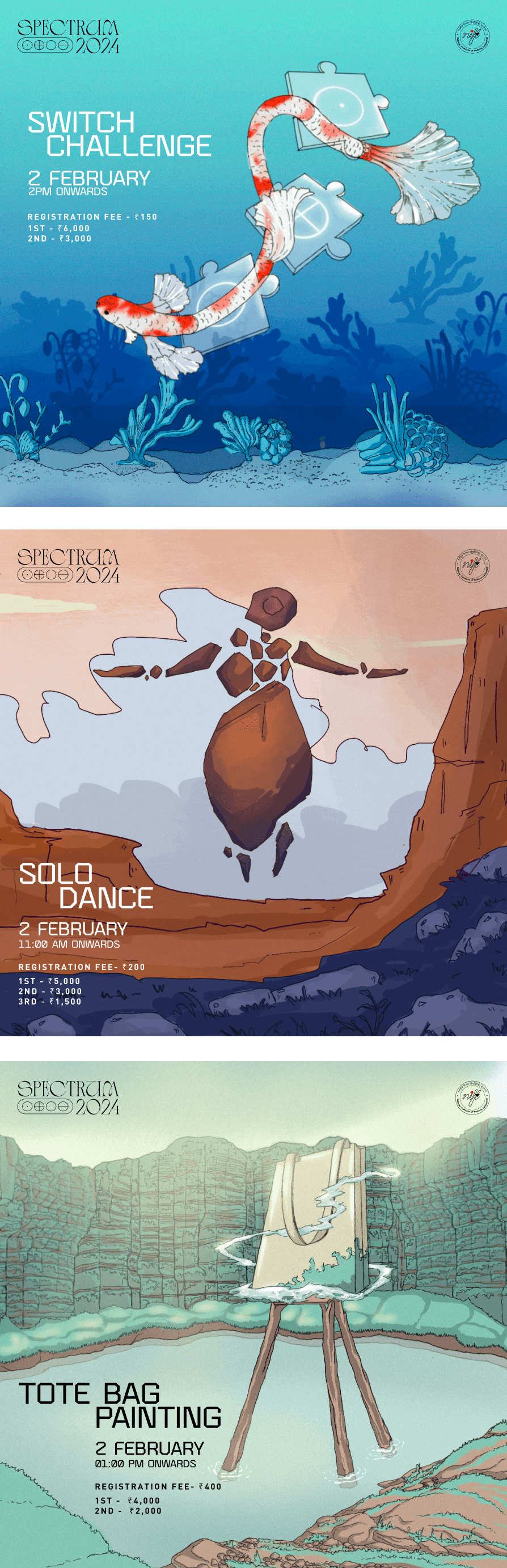
Poster Design
In a short duration of time we had to face the challenge of making over 30 event poster and we were able to define, ideate and prototype every post to suit each event while embracing the overall theme.The posters are divided into 7 categories based on the clubs hosting them. each club was given its own world and each event was represented through its own stylized structure.
In a short duration of time we had to face the challenge of making over 30 event poster and we were able to define, ideate and prototype every post to suit each event while embracing the overall theme.The posters are divided into 7 categories based on the clubs hosting them. each club was given its own world and each event was represented through its own stylized structure.

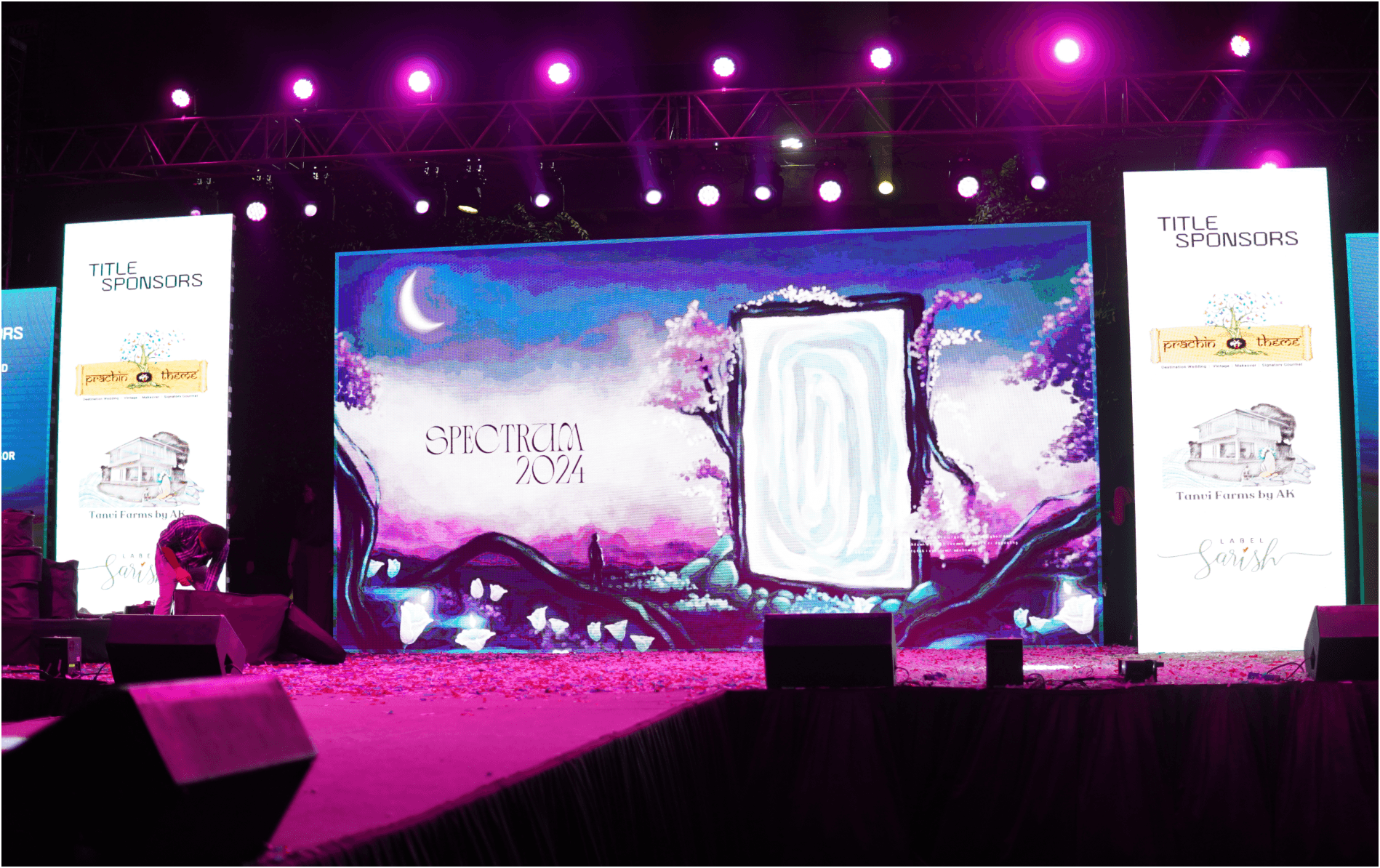
Stage Animations
The main stage is where all our work came together for the crowd to see.Following the path of 3D renders, we made a compilation of animations using procreate dreams that focus on landscapes for each f the four elements in a reimagined future.
The main stage is where all our work came together for the crowd to see.Following the path of 3D renders, we made a compilation of animations using procreate dreams that focus on landscapes for each f the four elements in a reimagined future.
Conclusion
The event was a remarkable success, drawing 5,000 attendees over two days and demonstrating the effectiveness of our branding and teamwork. We encountered several challenges along the way, but by actively incorporating stakeholder feedback, we were able to make real-time adjustments that enhanced the overall experience. Participants, sponsors, and faculty expressed their satisfaction with the engaging atmosphere and seamless execution.
The event was a remarkable success, drawing 5,000 attendees over two days and demonstrating the effectiveness of our branding and teamwork. We encountered several challenges along the way, but by actively incorporating stakeholder feedback, we were able to make real-time adjustments that enhanced the overall experience. Participants, sponsors, and faculty expressed their satisfaction with the engaging atmosphere and seamless execution.