Brand Identity and Packaging Design
Overview
We developed a comprehensive brand identity that resonates with the target audience, communicates the brand values, and differentiates it from competitors. The brand identity should evoke trust, reliability, and effectiveness while also being aesthetically appealing.
Role:
Visual Designer
Duration:
June- July 2024
Team:
Vaishnavi Maganti, Jahnavi Maganti
Deliverables:
Logo, Packaging, Web creatives

Target Audience
Urban/metropolitan residents
25-45 year olds
High-stress jobs
Brand Positioning
For individuals seeking effective solutions to hair loss and thinning, Amright is a science-driven hair care brand that offers clinically proven products to reduce hair fall and promote hair growth. Unlike other hair care brands that rely on generic formulas, Amright combines cutting-edge research with potent, scientifically backed ingredients to deliver visible, lasting results, empowering users with stronger, healthier hair.
Brand Personality
Brand personality is the set of human characteristics associated with a brand. which creates a unique and identifiable image in the minds of consumers.
The personality we chose is ‘ Hair Guru ’
Veteran of the Journey: Like a seasoned mentor, the Hair Guru has been through every possible hair care challenge and emerged victorious.
Simplifies Science: While rooted in rigorous scientific research, the Hair Guru breaks down complex concepts into easy-to-understand language.
Approachable and Down-to-Earth: Despite their expertise, the Hair Guru is friendly, approachable, and never intimidating.
Journey Companion: The Hair Guru is with you every step of the way, from the first signs of hair trouble to the final victory over your hair care issues.
Brand Communication
Based on research into the target audience and competitive landscape, the strategic conclusions for Amright are as follows:
Build Trust: Like other market leaders, Amright must establish itself as a reliable brand, given the sensitive nature of hair fall issues.
Simplify Science: Make scientific information accessible and highlight the safety and efficacy of ingredients to enhance credibility.
Use Bold Colors: Employ striking visuals to immediately capture attention and stand out from competitors.
Adopt a Factual Tone: Communicate with authority to assure consumers of the brand’s credibility and effectiveness.
Create Empathy: Use anecdotal messaging to connect with users on a personal level, showing they’re not alone in their hair care journey.
Process
1 of 4
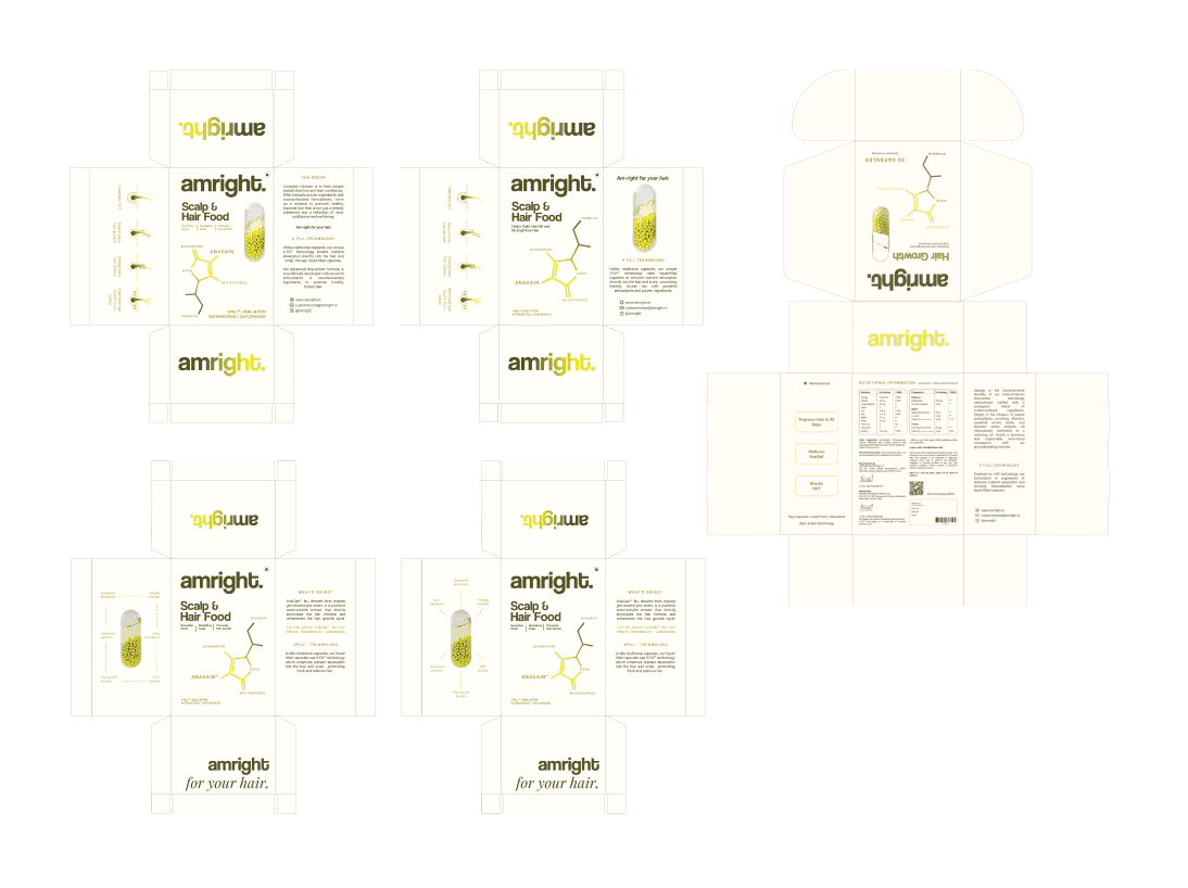
Logo Design
Following a team discussion, it was concluded that a wordmark logo would be the most effective for ensuring both legibility and recognizability. After exploring various options, designs (4) and (5) emerged as the favorites.
To further validate these choices, a small market survey was conducted to assess the emotional impact and impressions of these logo mockups.

Iterations:
From the survey, it was determined that the selected logo design was perceived as the most trustworthy and gender-neutral. I then proceeded to evaluate how effectively this logo performs in various packaging scenarios to ensure its practical application.


Final Logo:
The brand name "amright" combines "am" and "right" to reflect confidence in its purpose. The bold, sharp-edged logo with a full stop reinforces this impact, while the all-lowercase design balances assertiveness with approachability.
2 of 4
Color Palette
A monochrome color palette emphasizes simplicity and elegance, enhancing brand recognition with its clean, unified look. It offers cost efficiency in production and ensures focus and clarity by reducing visual clutter.

3 of 4
Typography
Coolvetica, a geometric sans serif, combines informal warmth with trustworthiness through its rounded terminals and uniform strokes. Roboto, a modern sans serif, blends clean, geometric shapes with subtle humanist influences, offering both professionalism and approachability for body text. Pairing Playfair Display with Coolvetica creates a visually engaging contrast.
4 of 4
Iconography
Filled-in icons with gradients offer bold, impactful visuals that enhance visibility, ensuring they stand out prominently and capture attention.

Execution
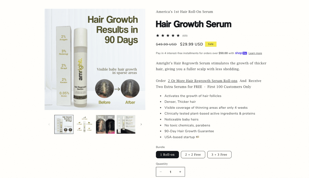
Website Imagery
Keeping consumer psychology in mind, it was crucial to make the imagery on the website predominantly picture-based and results-oriented in order to build trust in the brand. This was achieved by incorporating statistics and before-and-after pictures.
In the Press


Challenges and conclusion
While edible supplements have gained significant popularity in international markets, their presence in India is still emerging. One of the primary challenges we face is offering these products at an affordable price despite the high manufacturing costs associated with imported ingredients. To address this, we emphasized the use of clinically tested ingredients on our packaging to highlight the quality and efficacy of our supplements.
Additionally, with several established brands already present in the Indian market, differentiating our brand through effective branding strategies has become crucial. Another significant challenge has been the frequent changes in product packaging and dimensions by manufacturers, which has necessitated ongoing adjustments and updates to our layout and design.