UI Redesign for Digital Gold App: Growth and Retention

Overview
I redesigned a digital gold investment app to enhance usability, consistency, and user engagement. The new interface simplified navigation and interactions, leading to improved retention and a 10x growth in the user base.
As the UI and Visual Designer, I collaborated with the product manager and development team to simplify the app’s interface and enhance usability. I also led the rebranding process, ensuring consistency across digital and print assets.
Role:
UI/ Visual Designer
Duration:
Jan- March 2024
Platform:
Collaborators:
Context
As a startup in digital gold and silver investment, prioritizing a user-first approach is essential for user retention. As the company expands, our focus shifted to improving the onboarding process and app intuitiveness.
Problem
I conducted user research by means of interviews and observing user interactions with the application. Through this process, I evaluated their visual frustrations. Concurrently, the team identified a significant drop in the conversion rate of first-time users who downloaded the app but did not make purchases. This indicates a cumbersome onboarding process.

Three significant problems emerged:
Overall, the user feedback highlights the need for significant enhancements to the application's user interface in terms of consistency and simplicity.
Goal
Streamline the onboarding process by addressing user frustrations, improving the interface, and increasing the conversion rate of first-time users.
Process

IDENTIFICATION
I identified the multiple usability issues with the old app by conducting usability testing with friends and family.
IDEATION
I developed wireframes and simplified the previous app to solve the usability issues
PROTOTYPING
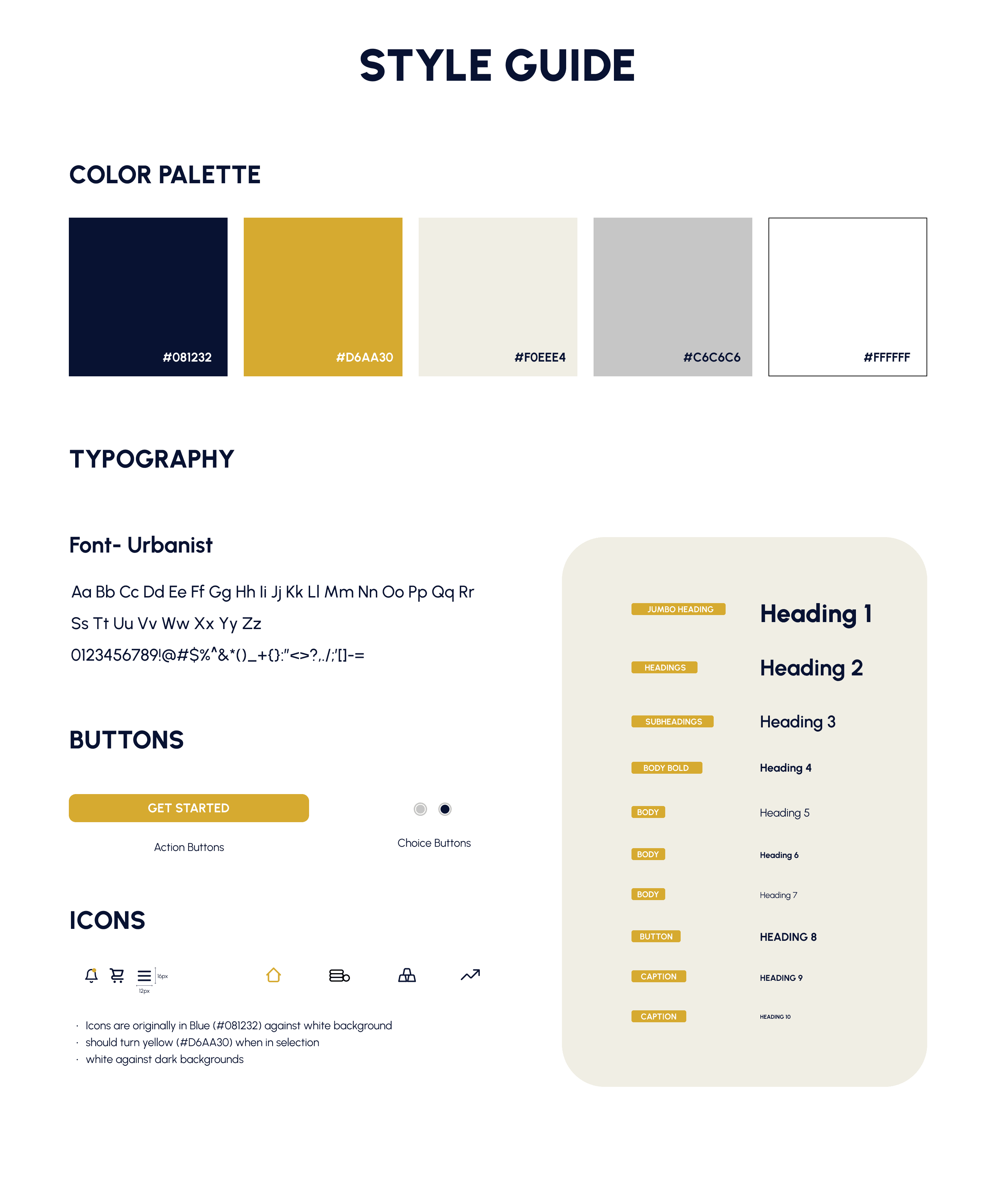
I made the style guide, and prototype and discussed with the tech team to make it a seamless transition
Usability Issues
Lack of visual hierarchy
Inconsistent proximity
Too much data input
Rapid Wireframing

Style Guide
Solutions
The final solutions effectively resolved the key issues and met the expectations of all stakeholders. These improvements are now utilized by a current user base exceeding 50,000.
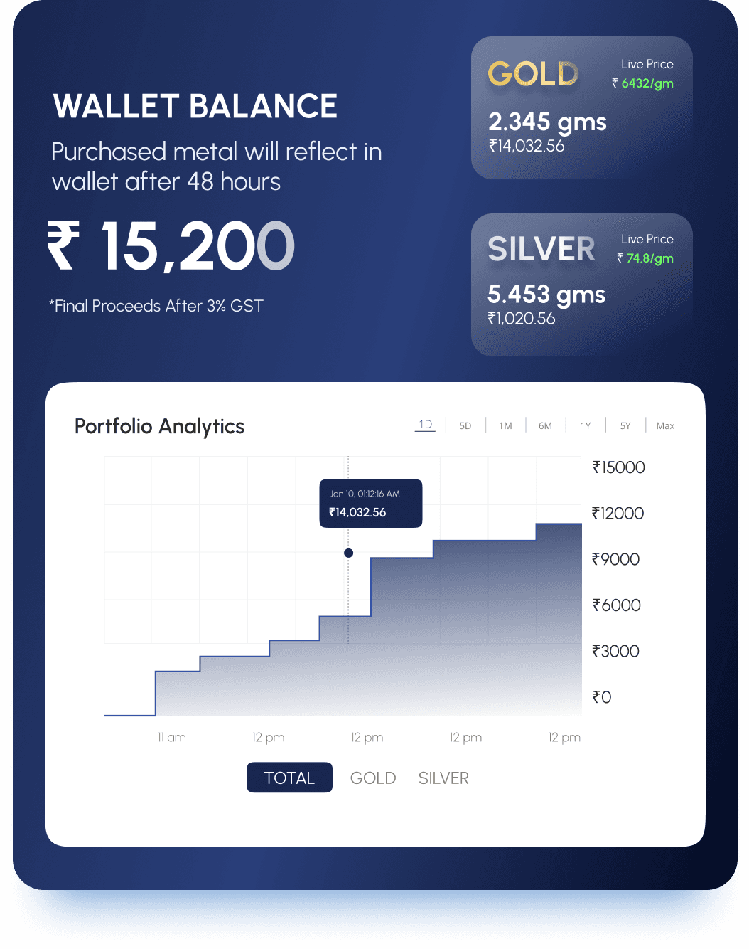
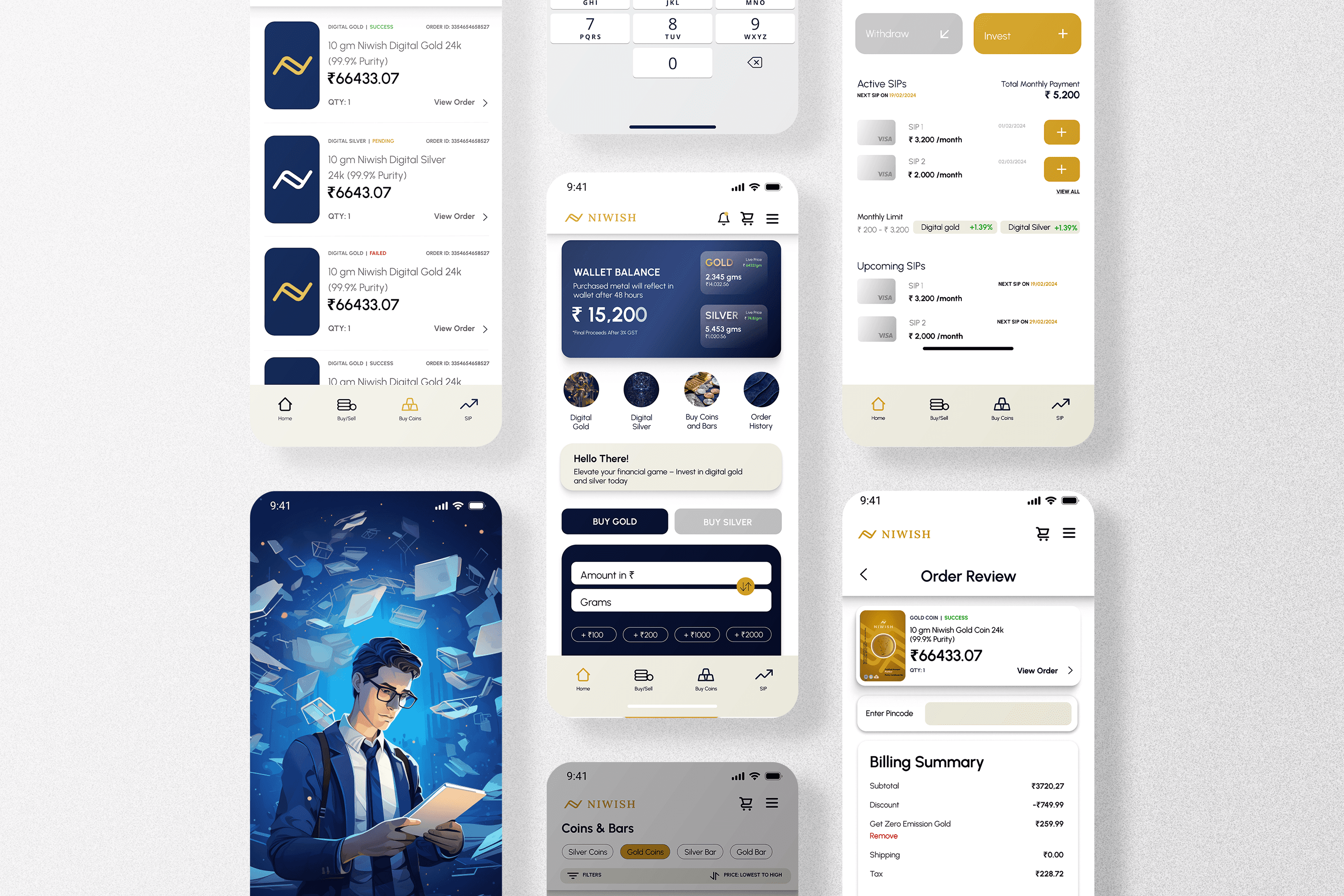
Simplified home screen widget

Collapsible Wallet balance
Simple navigation bar

Step by Step process in SIPs

Order tracking

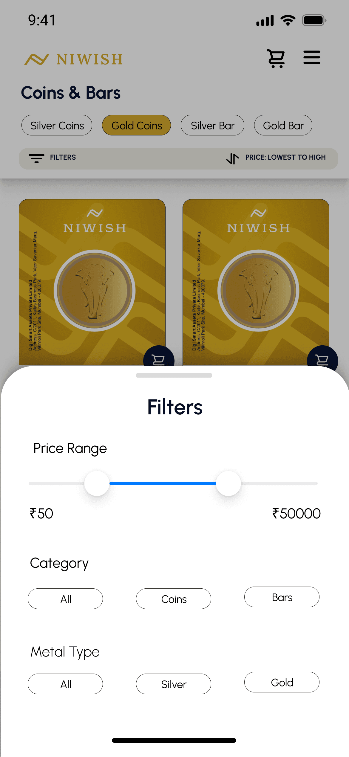
Sorting and filters
Before- After Comparison


Prototype
Here is the Figma prototype
Conclusion
In conclusion, user research conducted by the product team was instrumental in identifying key user frustrations, which allowed me to address these issues effectively in the redesign. The development team successfully implemented the majority of the design, with some elements reserved for future growth. As a result, the app's user base grew significantly from 6,500 to over 50,000, and ongoing testing is being conducted to drive further improvements.